
Tags
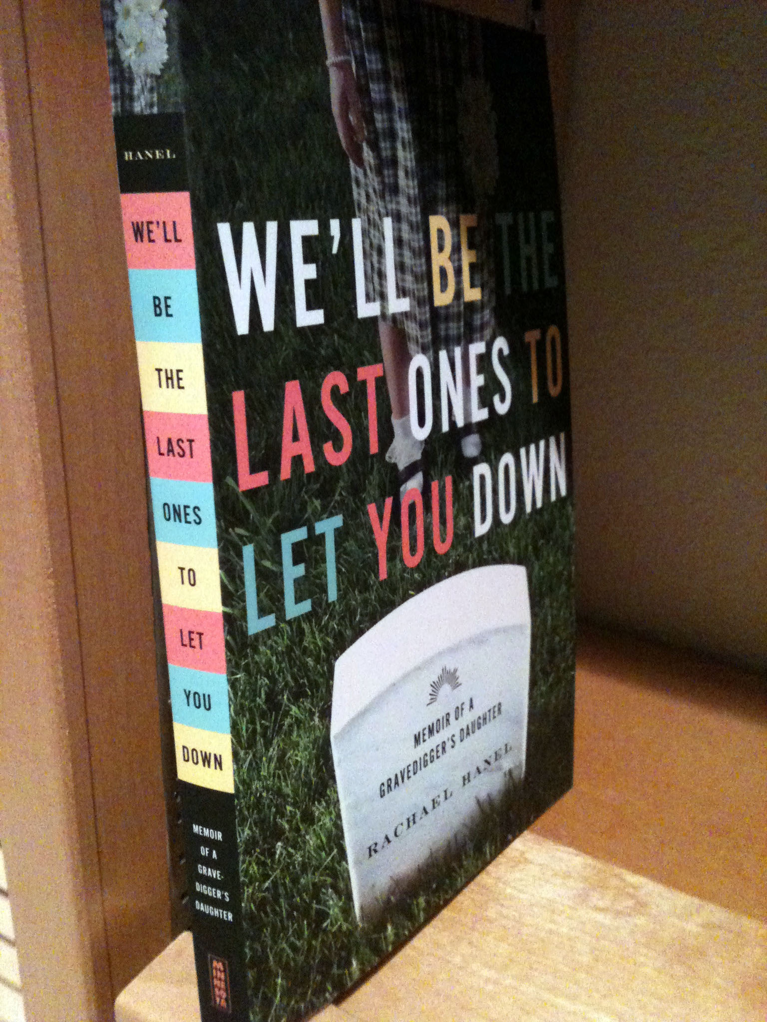
Photo by author.
My first copy of the actual book arrived today. I’m so pleased! I first saw the cover several months ago. University of Minnesota Press staff asked me for cover ideas back when my book was accepted for publication. Here are the two ideas I gave them:
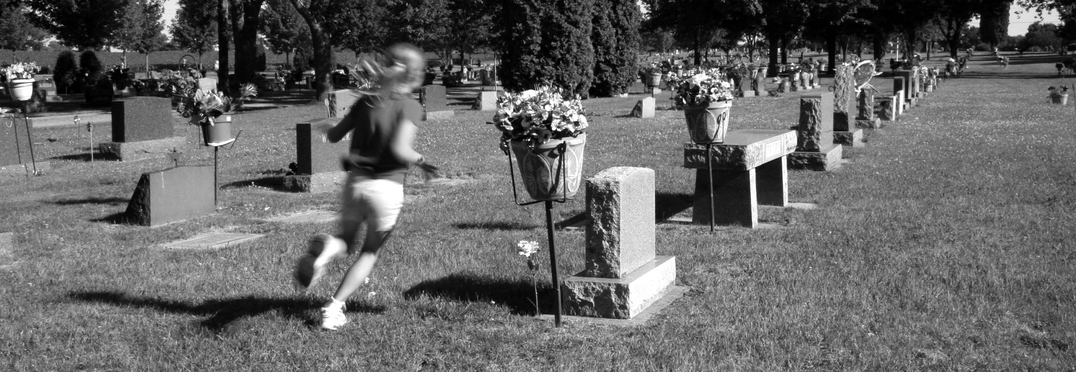
Photo by author.
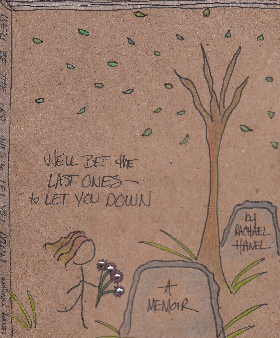
Illustration by Ann Rosenquist Fee.
I provided these as concept photos. I thought the cover definitely needed to have a gravestone, since my dad was a gravedigger. But I thought a cover with only a gravestone might give the wrong impression, that it was a book only about cemeteries. So I wanted also some type of image of a girl, something that illustrated the concept that there was life within the cemetery, that it was a place where a young girl roamed and wandered and wondered. The designer understood that concept, and I’m so happy with the result.
What I didn’t know until today was what the spine would look like. I love it! I love the blocks of color and the title set within those words. The color scheme seems vaguely 1970s, which reflects the time period of the book. I think it has great shelf appeal–something that stands out due to its design.
I’m a designer wanna-be. I admire good graphic design and typography and use of color. I would love to learn more about graphic design. I did some rudimentary publication layout when I worked at The Mankato Free Press as a copy editor, and it would be neat to extend those skills.
But until then, I will just admire people who do it well.

Love the whole design! Your own are pretty good, too, but they did you right. Congratulations!
Thanks, Richard! I am really happy with what they did.
🙂
Congratulations, Rachael! Looking forward to reading your book.
Thank you so much! I appreciate it!
🙂 Back atcha!